

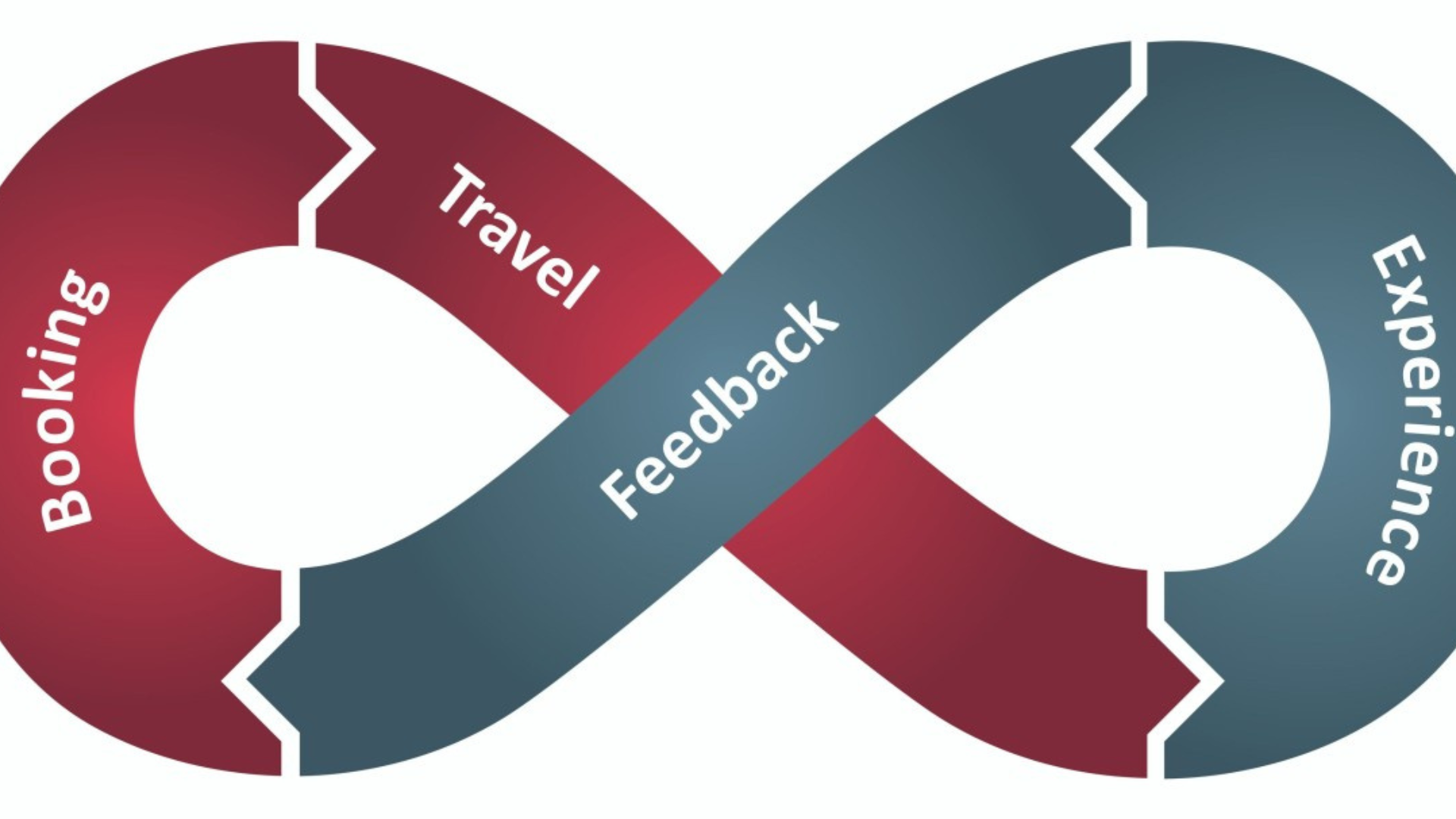
You’ve invested in a great-looking website. The images are sharp, the branding is on point, and traffic is coming in from ads, SEO, or social media.
But bookings? Still not where they should be.
In fact, many hotel websites convert at significantly lower rates than Online Travel Agencies, often because the issue isn’t traffic but poor conversion systems, as highlighted in this analysis by DHI Hospitality
This is one of the most common problems in hospitality today. And the reality is simple: most websites aren’t built to convert, they’re built to look good.
A hospitality website should act like your best salesperson, guiding users toward a booking decision. But when it fails to do that, even high traffic won’t translate into revenue.
Let’s break down where things go wrong and how to fix them.
Your Website Looks Good, But Doesn’t Guide Decisions

Many hospitality websites prioritize visual appeal over usability, which often leads to poor conversion outcomes, a challenge also discussed in detail by The Percentage
When a visitor lands on your website, they’re not there to admire design. They want quick answers, availability, pricing, location, and why they should choose you.
If your website doesn’t guide them clearly, they leave.
The fix here is simple: shift from a design-first mindset to a decision-first approach. Every section of your site should answer a question or move the user closer to booking.
A clear, visible “Book Now” button should always be within reach, not hidden behind scrolls or menus.
Slow Load Times Are Quietly Costing You Bookings
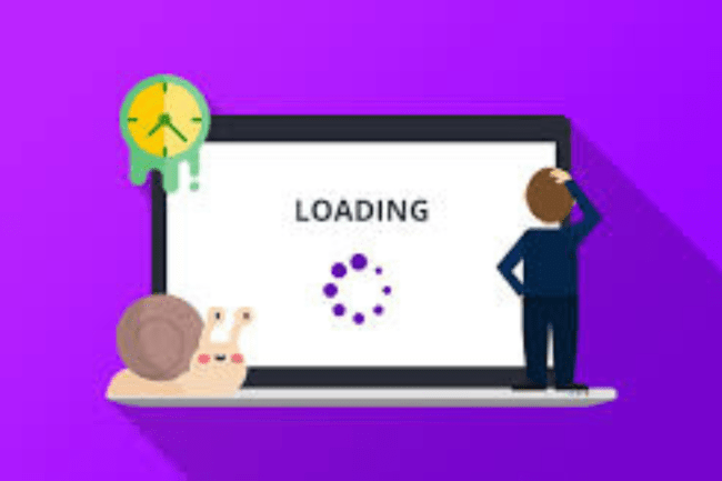
Speed is one of the most underestimated factors in conversion.
A delay of even a couple of seconds can push users away, especially on mobile devices where patience is even lower. Many hospitality websites are overloaded with high-resolution images, videos, and scripts that slow things down significantly.
The problem isn’t obvious when you build the site but it shows up in bounce rates and lost bookings.
Improving speed doesn’t require a redesign. Compressing images, optimizing scripts, and choosing better hosting can make a noticeable difference.
Faster load times mean users stay longer, explore more, and are far more likely to convert.
Your Mobile Experience Isn’t Built for Real Users
Today, most users discover and explore hospitality options on their phones. But many websites still feel like scaled-down desktop versions rather than experiences designed for mobile.
When buttons are hard to tap, text is difficult to read, or booking steps feel long and frustrating, users simply exit and look elsewhere.
A mobile-first approach changes everything. Instead of adapting a desktop design, build the experience for smaller screens first. Keep navigation simple, make actions easy, and reduce the number of steps required to book.
If your mobile experience feels effortless, your conversion rate improves almost immediately.
The Booking Process Creates Friction
The biggest drop-off often happens when users are ready to book.
They’ve explored your site, they like what they see, but then the process becomes confusing or time-consuming. Sometimes they’re redirected to another platform, sometimes they’re asked to fill too many fields, and sometimes the interface changes completely.
At this stage, even small friction can break momentum.
The solution is to simplify everything. Keep the booking flow consistent with your website, reduce unnecessary steps, and avoid forcing users to create accounts before completing a booking. The easier it feels, the more likely users are to follow through.
Users Leave Because They’re Not Fully Convinced
A visitor reaching your booking page doesn’t mean they’re ready to commit. They’re still evaluating.
They might be wondering about cancellation policies, check-in timings, or whether they’re making the right choice. If those questions aren’t answered clearly, they hesitate, and hesitation leads to drop-offs.
This is where most websites fall short. They assume users already trust them.
Instead, your website should actively remove doubt. Clear policies, visible support options, and reassurance at key points can make a significant difference. Sometimes, a small detail like flexible cancellation or instant chat support is enough to close the gap.
Your Website Doesn’t Build Enough Trust

Trust plays a massive role in hospitality decisions.
Unlike buying a product, guests are committing to an experience. If they don’t feel confident, they’ll leave your site and book through an OTA where trust feels stronger.
This often happens because websites lack visible proof. Reviews are hidden, guarantees aren’t highlighted, and real guest experiences aren’t showcased effectively.
Adding trust signals across the site, especially near decision points, changes how users perceive your brand. When users feel confident, they don’t need to compare as much, and they’re more likely to book directly.
Important Information Is Hard to Find
One of the fastest ways to lose a potential guest is to make them search for basic information.
If users can’t quickly understand your pricing, room options, amenities, or location benefits, they won’t spend time digging deeper. They’ll simply move on.
Clarity is what drives conversion. The more easily users can understand their options, the faster they make decisions.
Instead of spreading information across multiple pages, bring key details forward. Make comparisons simple, highlight benefits clearly, and ensure users don’t have to think too much to move ahead.
You’re Not Tracking Where Users Drop Off
Many hospitality businesses don’t realize where they’re losing potential bookings.
Without tracking user behavior, it’s impossible to know whether people are leaving on the homepage, the room selection page, or during checkout. This creates a blind spot where decisions are based on assumptions rather than data.
Understanding user behavior is what turns guesswork into strategy. When you know exactly where users drop off, you can fix specific issues instead of making broad changes.
Even simple tracking tools can reveal patterns that lead to immediate improvements in conversion.
Your Traffic Isn’t Landing on the Right Pages
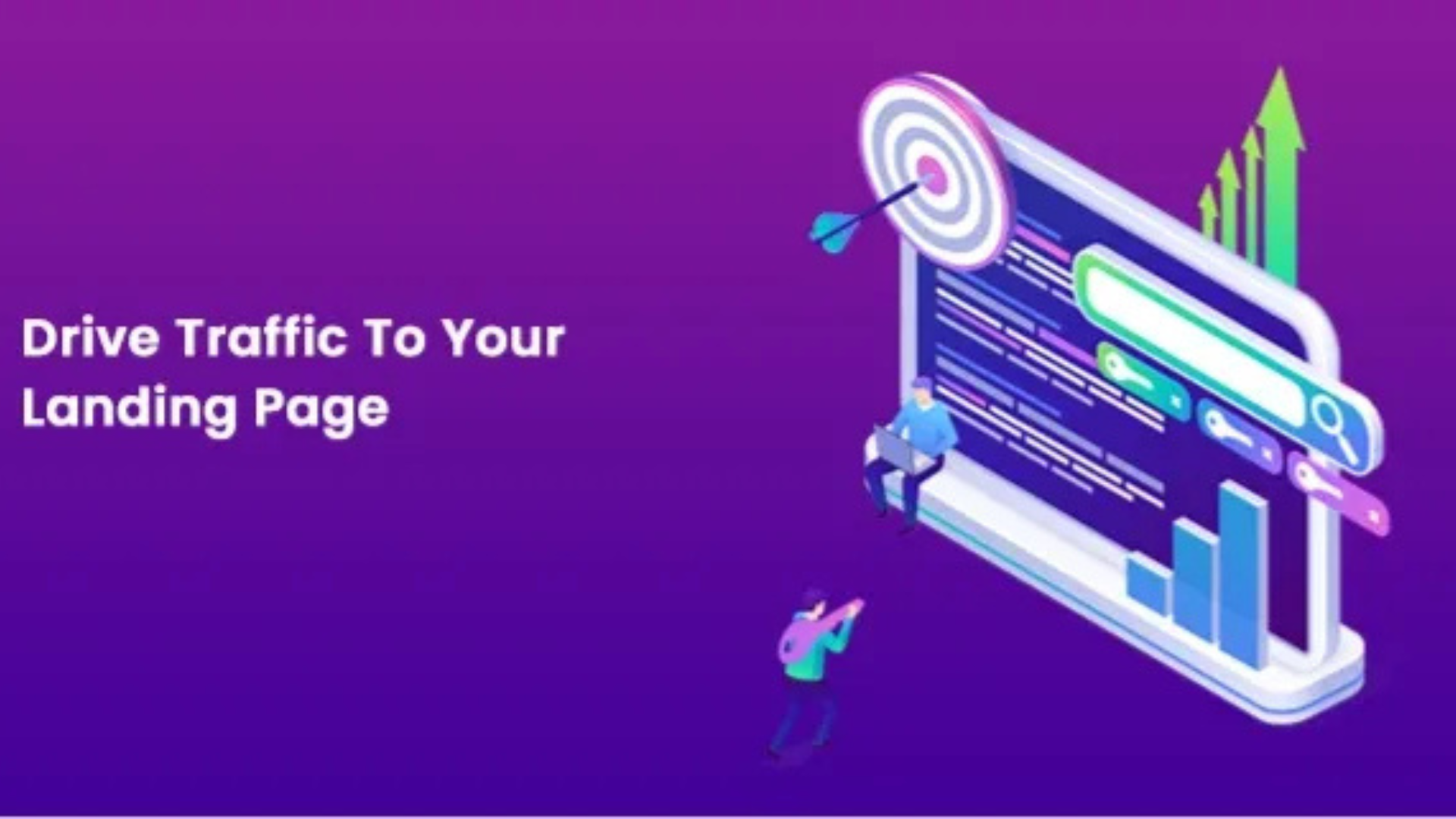
A common mistake is sending all traffic to the homepage.
But not all visitors are the same. Someone clicking on a “luxury stay” ad expects to see a luxury-focused experience, not a generic overview of your property.
When there’s a mismatch between intent and landing page, users lose interest quickly.
The fix is to create relevant landing experiences. Match your messaging with user expectations and guide them toward a specific outcome.
When users feel like they’ve landed in the right place, they’re far more likely to take action.
You’re Competing With Better Booking Experiences
Hospitality websites aren’t just competing with each other; they’re competing with OTAs that are optimized for conversion.
These platforms are fast, simple, and familiar. Users trust them because the experience is predictable.
If your website feels slower, more complicated, or less reliable, users will leave and complete their booking elsewhere.
Closing this gap means improving usability, simplifying navigation, and offering clear advantages for booking directly. When your experience feels just as smooth or better, users have no reason to leave.
Final Thoughts: Turning Visitors into Bookings
Most hospitality websites don’t fail because they lack traffic. They fail because they don’t convert that traffic effectively.
But this also means the opportunity is right in front of you.
When you improve speed, simplify the booking process, remove friction, and build trust, your website starts working as it should as a system that consistently turns visitors into guests.
This is where the right strategy makes a real difference. Teams like Flying Goat Agency focus not just on bringing users to your website, but on ensuring those users actually convert.
Because in hospitality, growth doesn’t come from more clicks.
It comes from better decisions both by your team and your customers.